

Did you know: the Historical Emporium website is mobile-optimized?
Even though we love old fashioned things, we also love new-fangled gadgets, and have seen an increasing number of visitors to our website using their mobile phones and tablets to browse our catalog and make purchases.
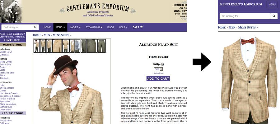
Because our old site was a bit unwieldy on mobile phones, last fall we redesigned our entire site to be easily and quickly browsable by phone, tablet, or desktop computer.
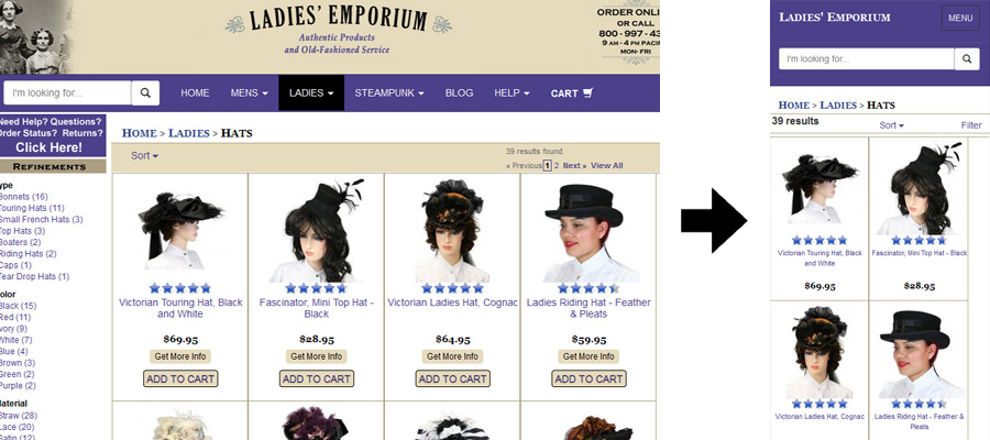
Our site uses “responsive design” to ensure that you have a good experience regardless of which device you use to visit.
The mobile version contains all of the same content, just reorganized for the smaller screen and with bigger buttons and larger text. Whether you visit us with your phone, tablet or computer, you will find all of the same great products, pictures, and content regardless of device.
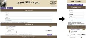
Our checkout process has also been designed with the mobile user in mind, with large data fields and big buttons for easy navigation.
If you haven’t done so already, be sure to visit our site using your mobile phone or tablet. And be sure to bookmark us, so next time you’re alone with your phone, you can pay us a visit!
Have you used our mobile website yet? Do you have any feedback for us? Let us know what you think!